

Get 100% Success with Latest Tableau Desktop Specialist Desktop-Specialist Exam Dumps Jun 30, 2024
The Best Desktop-Specialist Exam Study Material and Preparation Test Question Dumps
NEW QUESTION # 15
Which of the following are valid ways of Grouping Data?
- A. From the Analytics Pane
- B. Using Marks in the view
- C. Using Labels in the View
- D. From the Dimensions Shelf
Answer: B,C,D
Explanation:
Explanation
**IMPORTANT QUESTION AND EXPLANATION, PLEASE READ**
3 ways to group data -
1) Marks
2) Labels
3) Dimensions shelf.
*IMPORTANT*
If we Group the data by selecting the marks, then they remain separate marks in the view and then have the same colour. Also, a new group is created in the Dimensions shelf. Example - Using the sample superstore dataset, first plot a bar chart showing sales for each sub-category: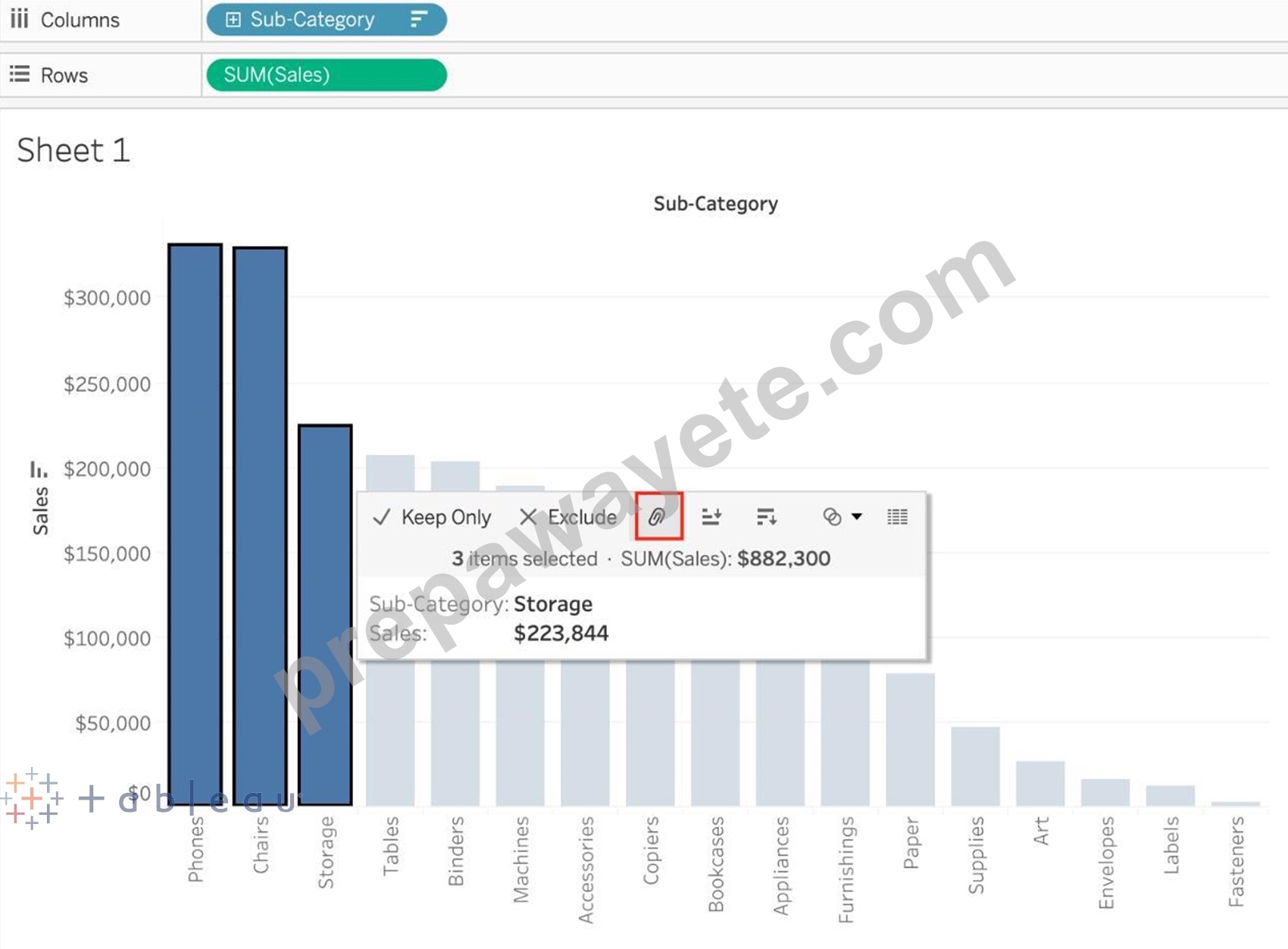
Here, if we Select Phones, Chairs and Storage by selecting the MARKS (Bars), and then group them: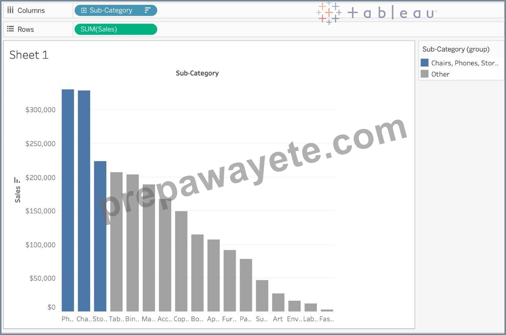
They remain seperate marks (BARS) but are grouped by the same colour.
Now, if we didn't do this, and rather grouped by selecting their Labels (Names):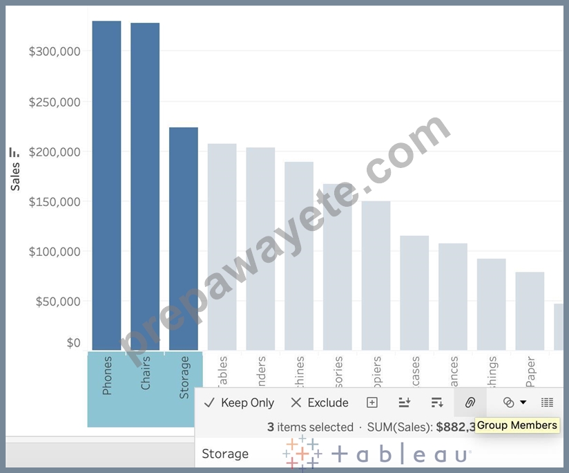
Then they no longer remain separate Marks (bars) but are rather consolidated into a single Bar: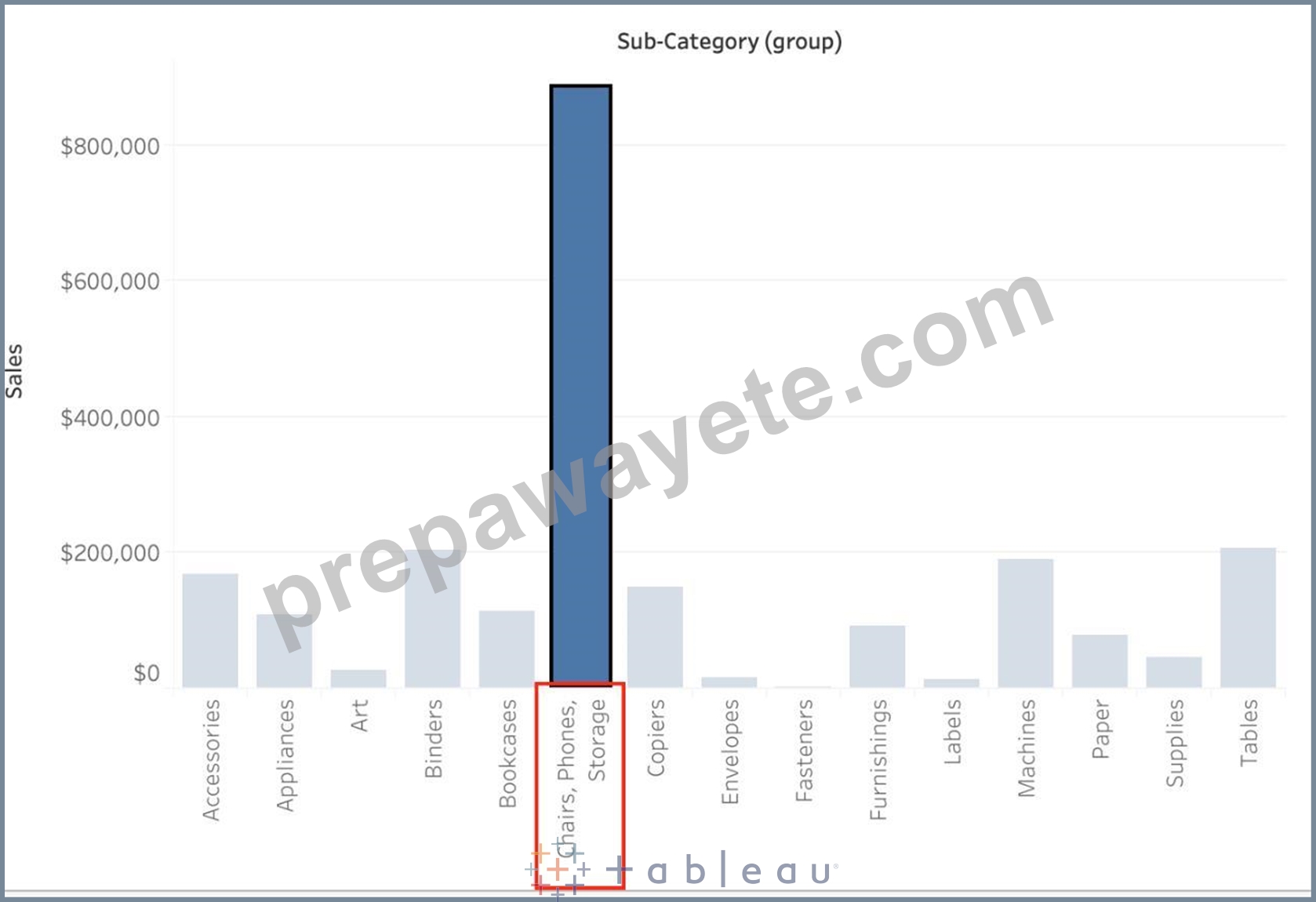
Finally, we can group directly from the Dimensions shelf as follows: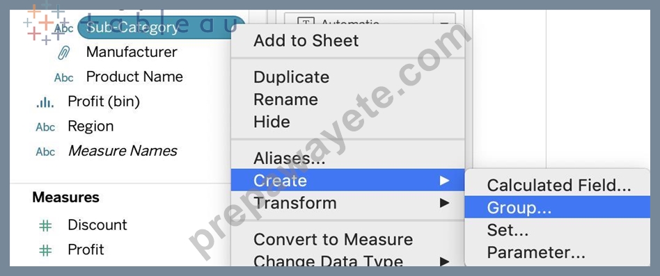
Now choose Phones, Chairs and Storage and Click Group: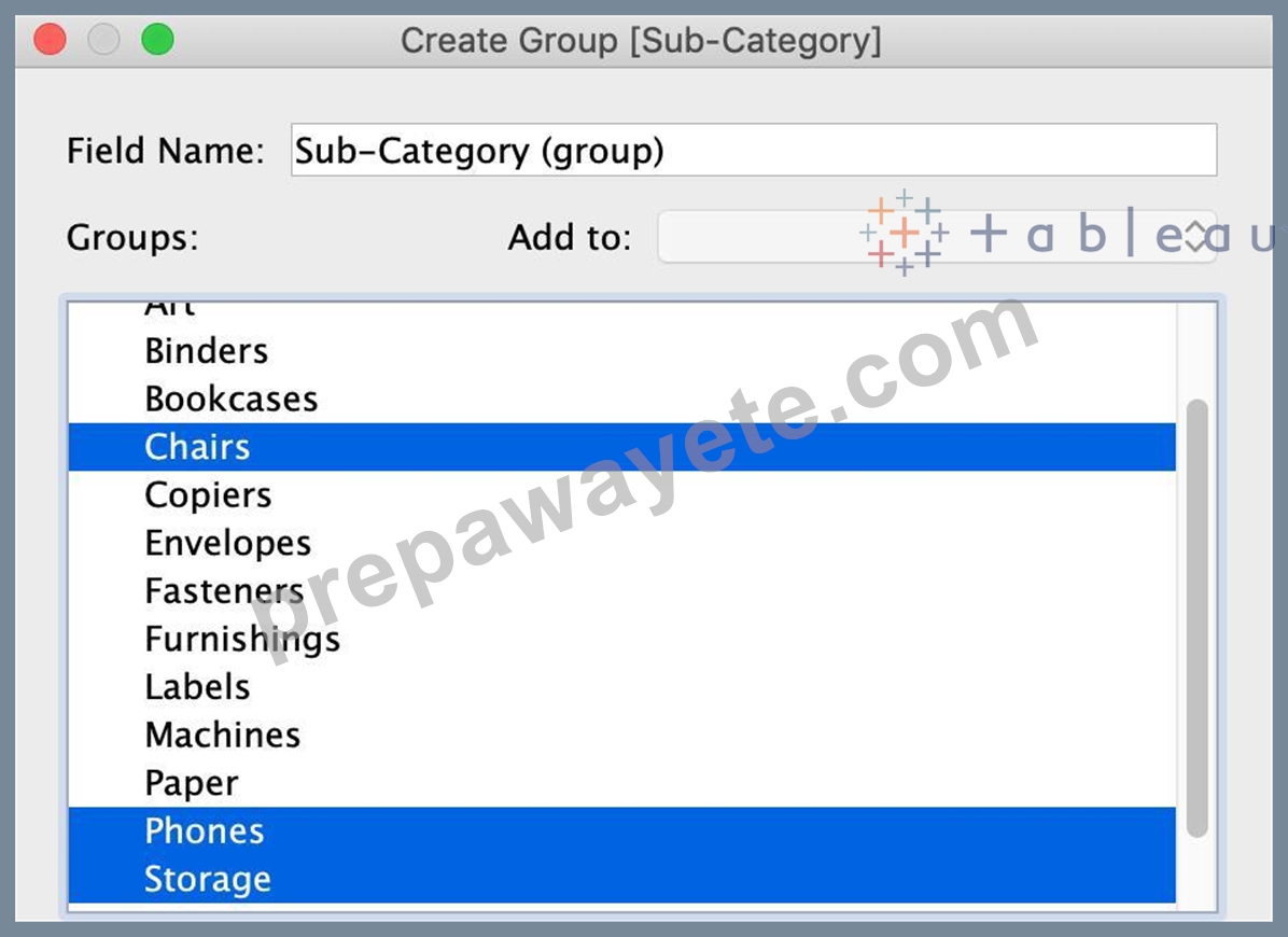
You will now automatically have a new Dimension as follows:
NEW QUESTION # 16
You have a visualization that uses multiple types of sorting.
How can you clear all sorting of the visualization?
- A. From the Dashboard menu, select Clear.
- B. From the Header label, select the sort icon.
- C. Right-click a sorted field, and then select Clear Sort.
- D. From the Worksheet menu, select Clear, and then select Sorts.
Answer: D
Explanation:
To clear all sorting in a Tableau visualization, you would go to the Worksheet menu, select the "Clear" option, and then choose "Sorts." This action removes all sorting that has been applied to the visualization, including any custom sorting or sorting based on multiple fields. This is a quick way to reset the view to its default sorting state and is particularly useful when you have applied various sorting layers and wish to start fresh.
NEW QUESTION # 17
You have a bar chart that has a dimension on the Columns shelf and a measure on the Rows shelf.
How can you make a stacked bar chart?
- A. Drag another measure to Color on the Marks card.
- B. Drag another dimension to Size on the Marks card.
- C. Drag another measure to the left of the measure on the Rows shelf.
- D. Drag another dimension to Color on the Marks card
Answer: D
Explanation:
To create a stacked bar chart in Tableau, you can drag a second dimension to the Color shelf on the Marks card. This action will segment the bars already present in the chart by the new dimension, stacking the segments on top of each other within each bar. This is a common method to add additional layers of detail to a bar chart and effectively compare parts to a whole across categories.
NEW QUESTION # 18
What does it imply if a field has a blue background?
- A. It is a dimension
- B. It is continuous
- C. It is discrete
- D. It is a measure
Answer: C
Explanation:
When you connect to a new data source, Tableau assigns each field in the data source as dimension or measure in the Data pane, depending on the type of data the field contains. You use these fields to build views of your data.
NEW QUESTION # 19
How can you change the default Tableau repository location?
- A. By clicking on Window -> Repository Location
- B. By clicking on Help -> Change Repository Location
- C. By Moving the repository location manually to wherever we want
- D. By clicking on File -> Repository Location and choosing a new location
Answer: D
Explanation:
According to the official Tableau documentation:
Graphical user interface, text, application Description automatically generated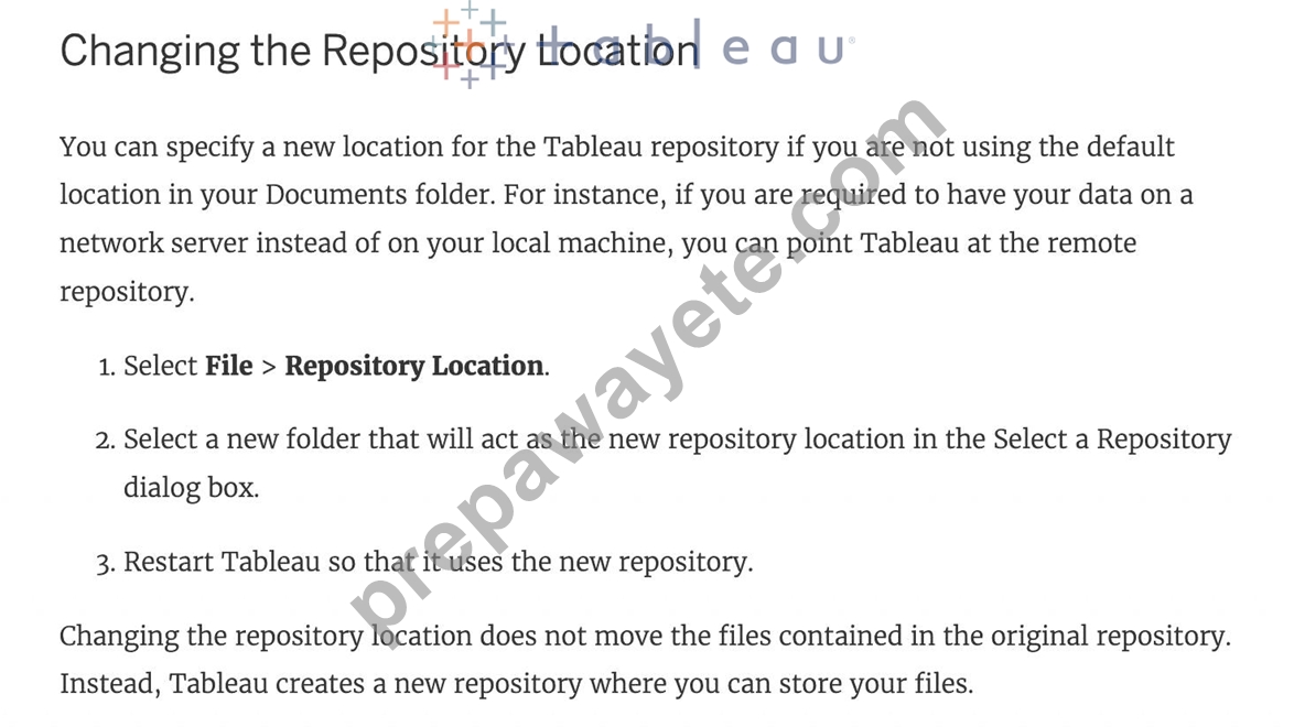
NEW QUESTION # 20
A ________________ is a single zip file that contains a workbook along with any supporting local file data and background images. This format is the best way to package your work for sharing with others who don't have access to the original data.
- A. .twbx file
- B. .tbm file
- C. .tde file
- D. .twb file
Answer: A
Explanation:
Explanation
According to the official Tableau documentation:
Tableau packaged workbooks have the .twbx file extension. A packaged workbook is a single zip file that contains a workbook along with any supporting local file data and background images. This format is the best way to package your work for sharing with others who don't have access to the original data. For more information, see Packaged Workbooks.
NEW QUESTION # 21
Which of the following returns the Absolute Value of a given number?
- A. FLOOR(Number)
- B. ZN(Number)
- C. ABS(Number)
- D. CEILING(Number)
Answer: C
Explanation:
From the official Tableau website: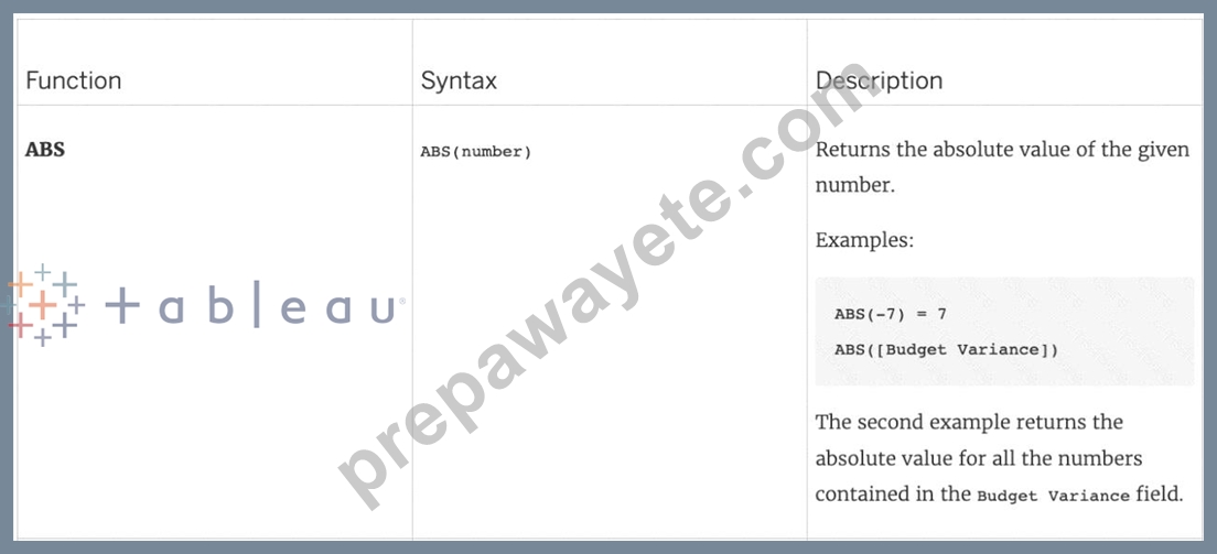
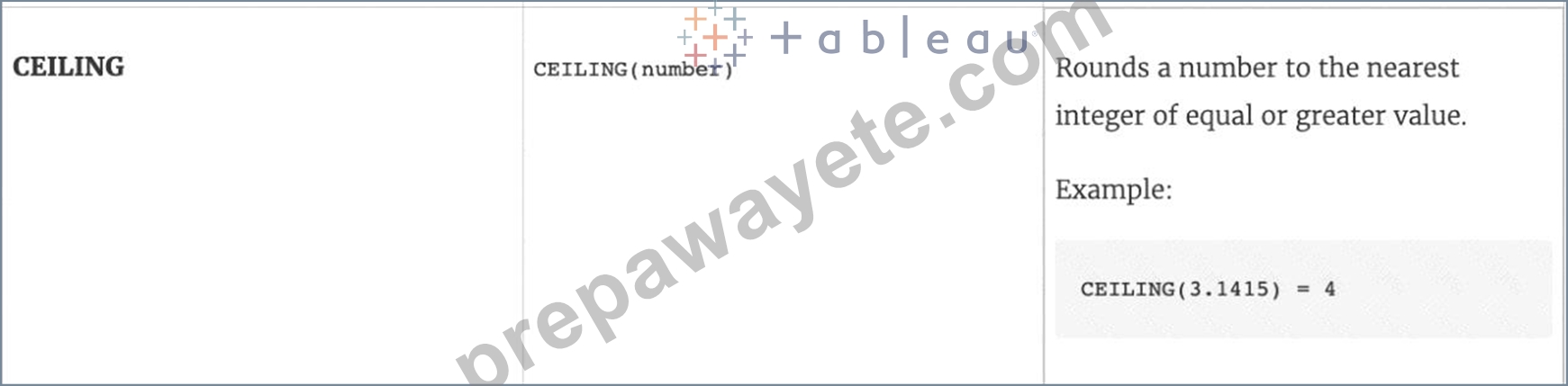
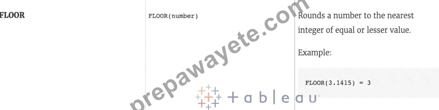
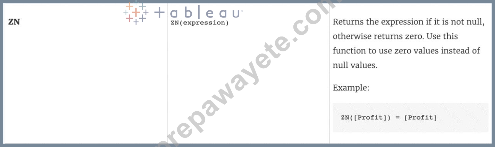
NEW QUESTION # 22
True or False: Context Filters are executed after Data Source filters
- A. False
- B. True
Answer: B
Explanation:
THIS IS A VERY IMPORTANT QUESTION
To answer this question, you need to understand Tableau's Order of Operations. See below and remember this always: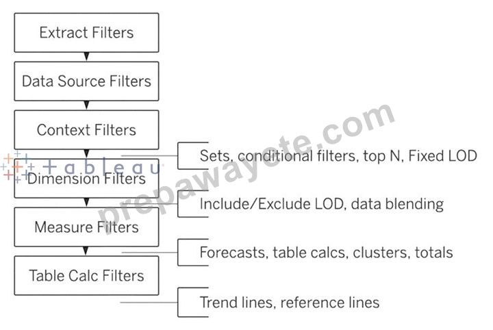
NEW QUESTION # 23
You need to display the complete list of potential data connections when you connect to a server. What action should you perform?
- A. Select Connecting to Data.
- B. Select File on the menu, and then select New
- C. Select More under To a Server
- D. Select More under To a File.
Answer: C
Explanation:
To display the complete list of potential data connections when connecting to a server in Tableau, you should select "More" under the "To a Server" option. This action will provide a comprehensive list of server types and data sources that Tableau can connect to.
NEW QUESTION # 24
Yes or No: The number of marks will increase when you increase the number of Dimensions in a view
- A. No
- B. Yes
Answer: B
Explanation:
Of course! As an example, see below:
1) Using the Sample Superstore data, let's plot a bar chart showing the Sales for each Category: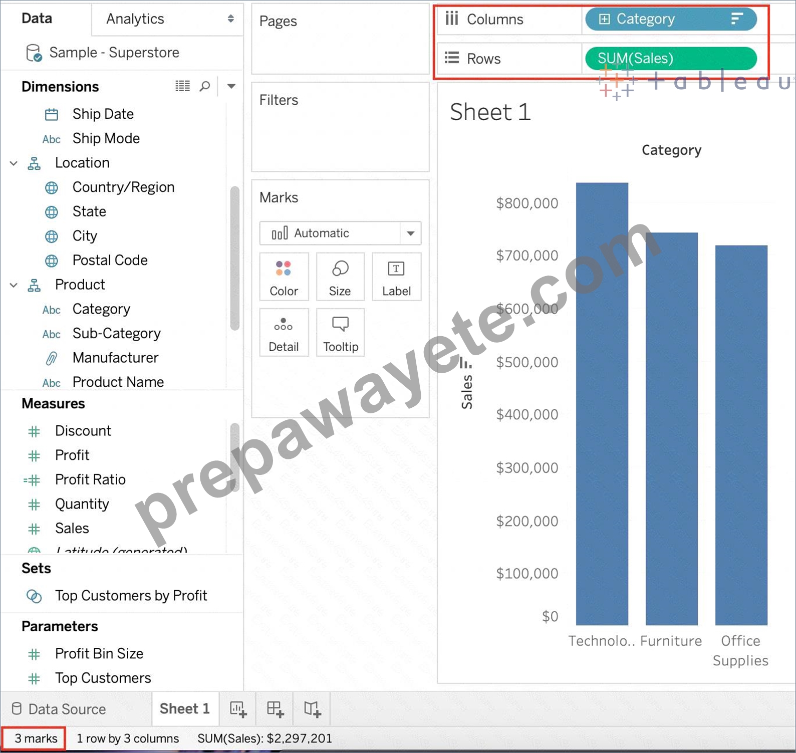
Observe that we have 3 marks - Each bar in a bar chart is called a mark. Similarly, each point in a scatter plot is also a mark , and so on for all charts.
1 row by 3 columns means that clearly on the y-axis (Sales), we have only a single mark - a single continous axis, but 3 different marks (Technology, Furniture and Office supplies ) on the x-axis.
2) Now let's add subcategory to the view as well (another dimension):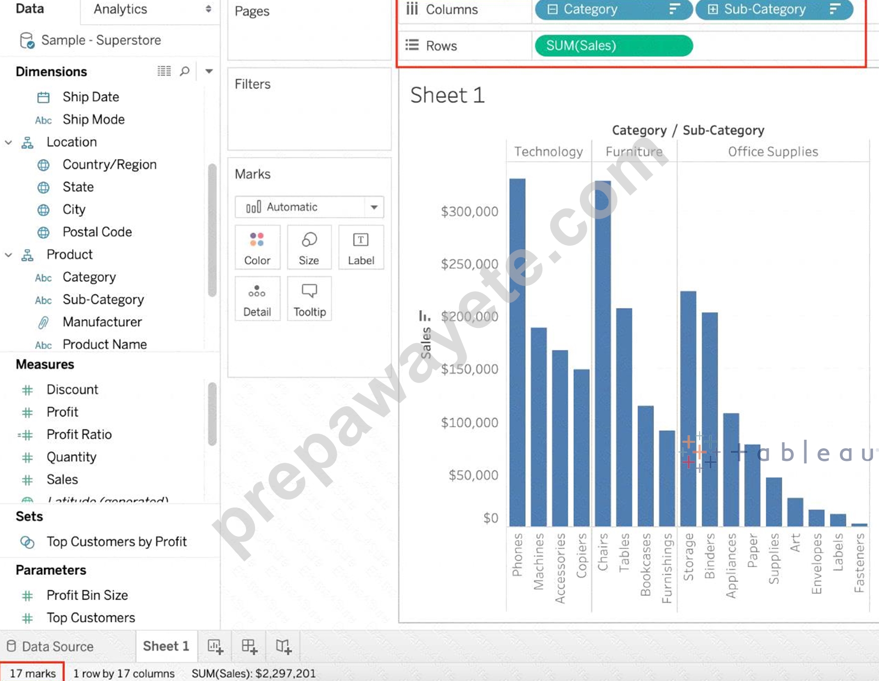
Observe that the number of marks has increased - i.e the number of Bars.
Also, notice we now have 1 row and 17 columns. Simply because 1 row = Sales (on the y-axis), and on the x-axis, we have 17 different columns (i.e product sub categories!!)
NEW QUESTION # 25
True or False: Trend lines can only be used with numeric or date fields
- A. False
- B. True
Answer: B
Explanation:
You can show trend lines in a visualization to highlight trends in your data.
To add trend lines to a view, both axes must contain a field that can be interpreted as a number. For example, you cannot add a trend line to a view that has the Product Category dimension, which contains strings, on the Columns shelf and the Profit measure on the Rows shelf.
However, you can add a trend line to a view of sales over time because both sales and time can be interpreted as numeric values.
NEW QUESTION # 26
Question 30: Skipped
Using the CoffeeChain table, create a scatter plot of Profit (x-axis) vs Sales (y-axis) broken down by State.
Add a Linear trend line to the view. What is its R-squared value?
- A. 0.759329
- B. 0.748472
- C. 0.783262
- D. 0.739284
Answer: C
Explanation:
Trend lines have become popular questions in recent Tableau examinations. Follow along:
1) First drag Sales to the Rows shelf and Profit to the Columns shelf: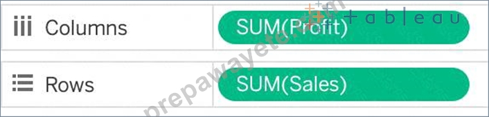
c
You will only see a single mark since the view is aggregated.
2) Now, break down this view by state. Drag State into Detail on the Marks shelf ( or directly to the view):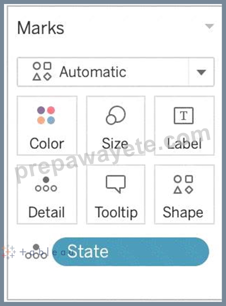
3) Finally, move to the Analytics pane, and drag Trend line to the view. When you drag it, select the Linear option!: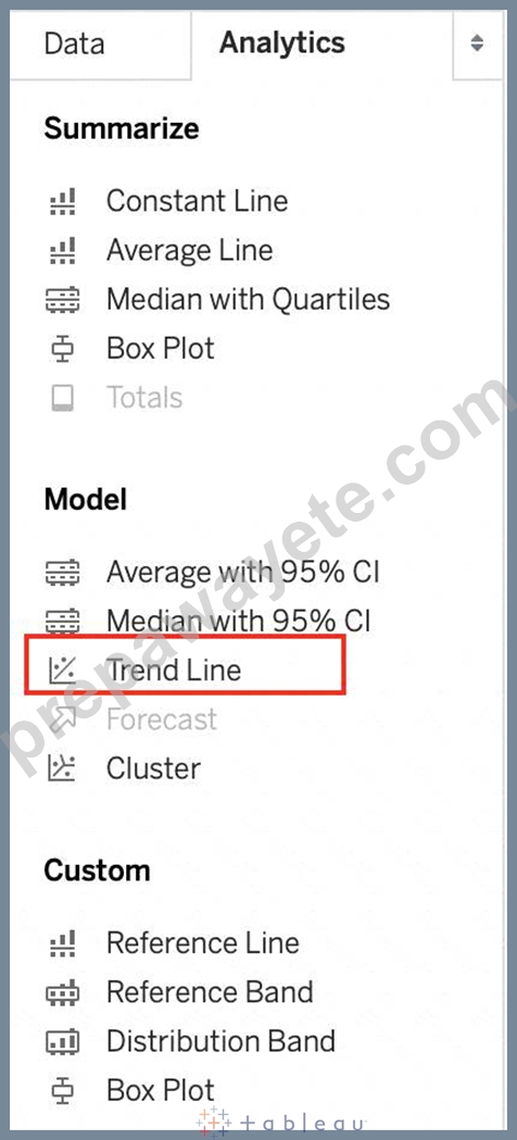
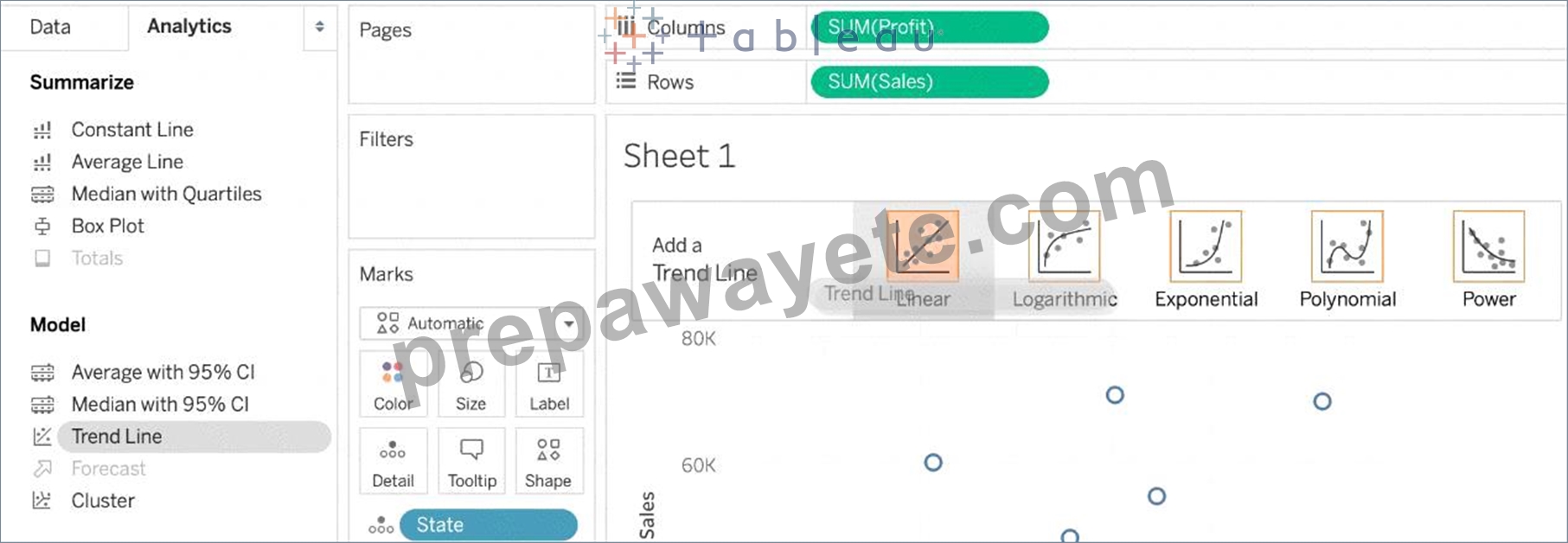
4) The following is our view. Hover over the trend line to see the R-squared value: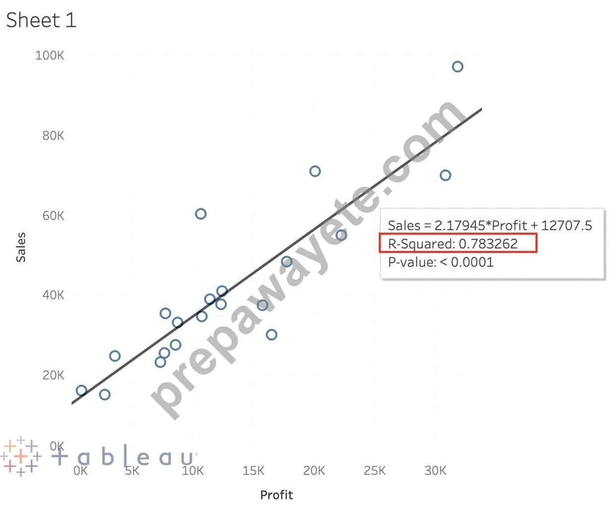
NEW QUESTION # 27
Which two analytics options are available for a scatter plot view? Choose two.
- A. Forecast
- B. Totals IS
- C. Trend lines
- D. Reference lines
Answer: C,D
Explanation:
For a scatter plot view in Tableau, you can add reference lines and trend lines as part of the analytics options.
Reference lines can be added to a visualization to mark certain values or to provide context, such as an average line across a scatter plot. Trend lines, on the other hand, are used to show the relationship between two variables in the view, indicating the general direction or pattern of the data points in a scatter plot.
NEW QUESTION # 28
You have the following visualization.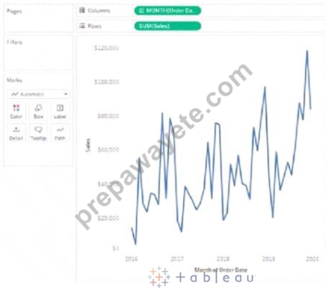
Where should you place a field named Region to show multiple distinct lines on the same axis?
- A. Path on the Marks card
- B. The Rows shelf
- C. Color on the Marks card
- D. The Columns shelf
Answer: C
Explanation:
To display multiple distinct lines on the same axis based on a field, you should place the field on the Color shelf in the Marks card. This will encode each distinct value in the Region field with a different color, resulting in separate lines for each region on the same axis.
NEW QUESTION # 29
You have a data set that builds a union between two tables. You need to extract the data set. What should you use to extract the data set?
- A. logical tables that use multiple table extracts
- B. logical tables that use a single table extract
- C. physical tables that use a single table extract
- D. physical tables that use multiple table extracts
Answer: B
Explanation:
When dealing with a union of two tables in Tableau, using logical tables with a single table extract is the most appropriate approach. Logical tables allow for the integration of data from multiple tables in a way that is seamless and efficient for analysis. By using a single table extract, Tableau consolidates the data from the union into one extract, optimizing performance and enabling faster data processing. This approach is particularly beneficial when working with large datasets or complex unions.
NEW QUESTION # 30
_______________ enables us to create workbooks and views, dashboards, and data sources in Tableau Desktop, and then publish this content to our own server.
- A. Tableau Public
- B. Tableau Prep
- C. Tableau Server
- D. Tableau myServer
Answer: D
Explanation:
Explanation
Tableau SERVER enables us to create workbooks and views, dashboards, and data sources in Tableau Desktop, and then publish this content to our own server.
Moreover, as a Tableau Server administrator you will control who has access to server content to help protect sensitive data. Administrators can set user permissions on projects, workbooks, views, and data sources.
NEW QUESTION # 31
Using the Time-series table, create a cross tab showing the Sales for each Item Number-ID, broken down by Assortments, then add Grand totals to the view. Which Item Number ID made the maximum sales across all assortments?
- A. 0
- B. Correct)
- C. 1
- D. 2
- E. 3
Answer: D
Explanation:
Follow along the steps below:
Drag Assortment and Year ID to the column shelf, and Item Number ID to the row shelf. Next, drag Sales to the Text label to create a cross-tab as below:
NEW QUESTION # 32
According to Tableau's 'Order of Operations', which of the following filters is applied FIRST?
- A. Extract Filter
- B. Measure Filter
- C. Context Filter
- D. Dimension Filter
Answer: A
Explanation:
According to Tableau's order of operations, the Extract filter is right at the top of the hierarchy. The data filtered in the Extract is then passed on to what we see in the Data Pane. See below:
NEW QUESTION # 33
True or False : Bins can be created on dimensions
- A. False
- B. True
Answer: B
Explanation:
Bin are a user-defined grouping of numerical data in the data source.
According to the official Tableau documentation: It's sometimes useful to convert a continuous measure (or a numeric dimension) into bins.
Have a look at the following image. When we right click a measure, we get the following options: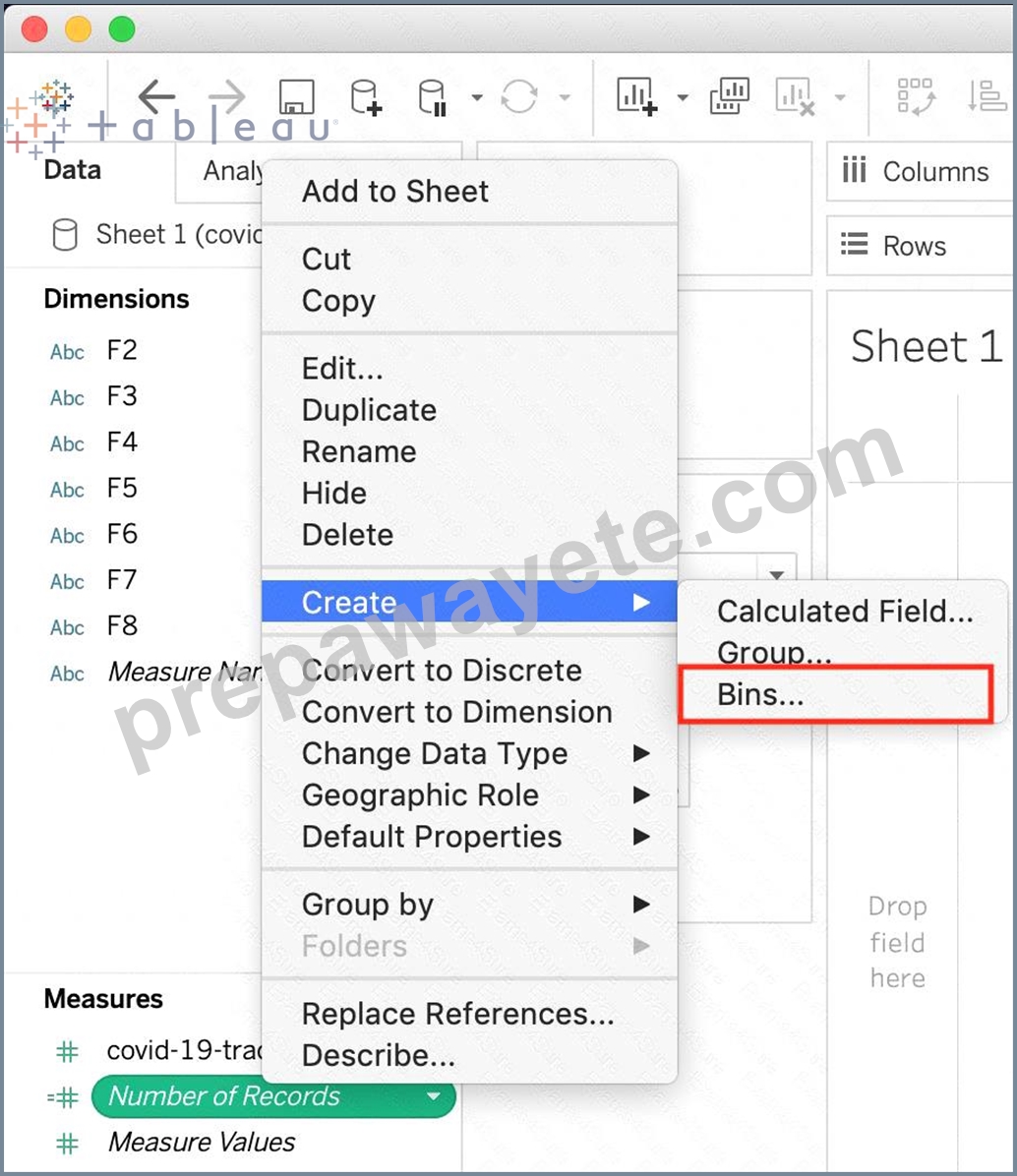
However, for a dimension (this is because the DATA TYPE of this dimension is a string: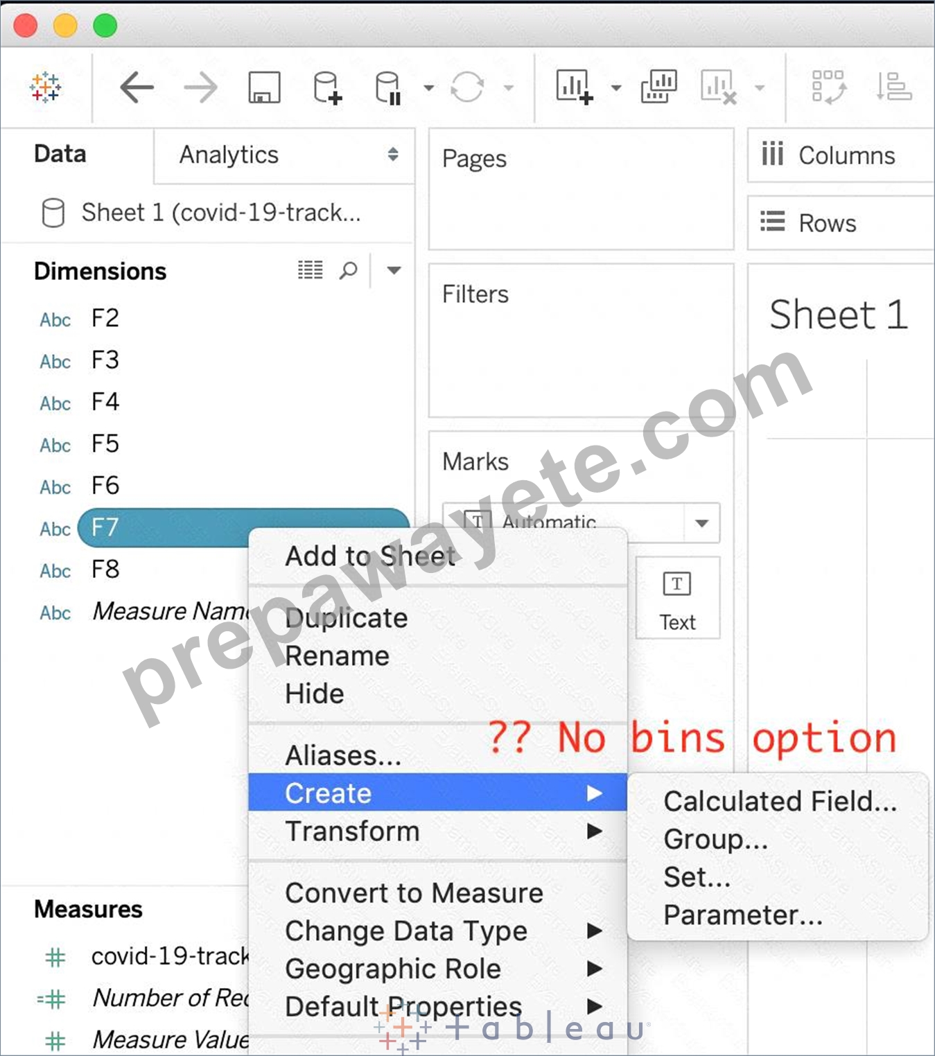
But what if we have a dimension of type NUMBER (NUMERIC DIMENSION)? See below: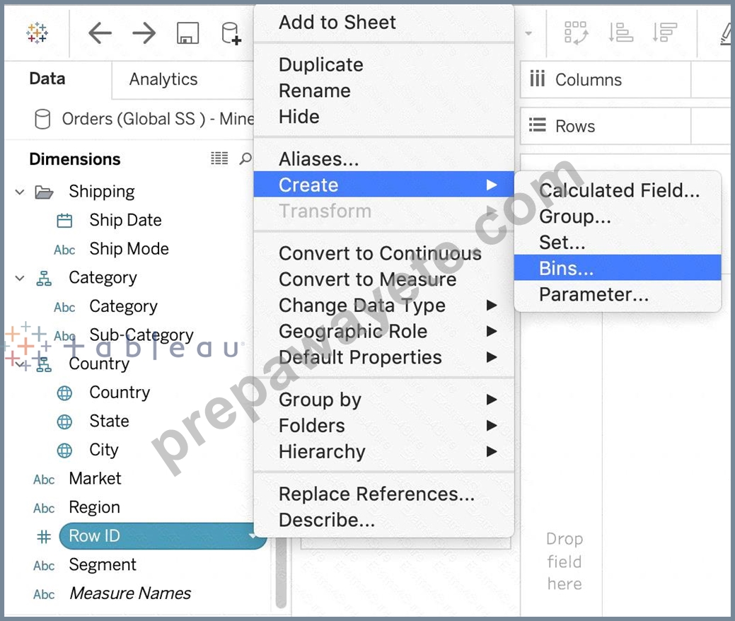
We can clearly create bins from dimensions too - they just have to be numeric :) For more information, please refer to
1: https://help.tableau.com/current/pro/desktop/en-us/calculations_bins.htm
NEW QUESTION # 34
Which of the following would you use to connect to multiple tables in a single data source at once?
- A. A Blend
- B. A Set
- C. A Hierarchy
- D. A Join
Answer: D
NEW QUESTION # 35
In an extract, what are three differences between a full refresh versus an incremental refresh? Choose three.
- A. An incremental refresh only adds rows that are new
- B. A full refresh replaces all the extracted data with the data in the underlying data source.
- C. An incremental refresh can only be run from Tableau Server.
- D. A full refresh is usually very slow. An incremental refresh can take less time.
- E. A full refresh must be configured. An incremental refresh is the default extract in Tableau.
Answer: A,B,D
Explanation:
According to the [Tableau Desktop Specialist Exam Guide], an incremental refresh only adds rows that are new, based on a specified column and value. A full refresh replaces all the extracted data with the data in the underlying data source. A full refresh is usually very slow, especially for large extracts. An incremental refresh can take less time, depending on how many new rows are added. A full refresh does not need to be configured, it is the default option for extracts in Tableau. An incremental refresh can be run from both Tableau Desktop and Tableau Server.
NEW QUESTION # 36
Using the CoffeeChain table, create a Dual Axis chart showing the Sales (Bar chart) and Profit (Line Chart) for each Product type. What was the Profit for the Herbal Tea product type in 2013?
- A. 74,683
- B. 68,620
- C. 46,493
- D. 37,455
Answer: D
Explanation:
If you answered this question quickly and correctly, you're well prepared for the exam! Most students stumble while creating a Dual axis chart, so go ahead and give yourself a pat on the back!
To create a dual axis chart for the problem mentioned:
1) Drag Product Type to the column shelf, and Sales and Profit to the Row shelf:
2) Now, to focus on 2013, drag Date to the filter shelf and select only 2013: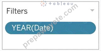
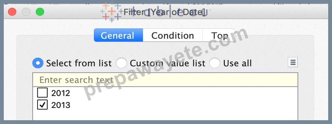
3) Now, click on the Profit pill in the Rows Shelf, and select dual axis: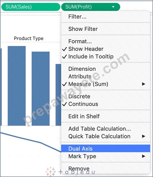
4) Now, in the marks shelf, choose Sales, and change the chart type to bar. Similarly, for Profit, change the chart type to Line.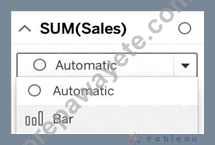
Now the chart looks like this: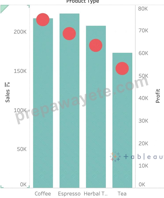
Now we change the Profit chart type to line: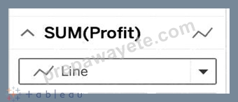
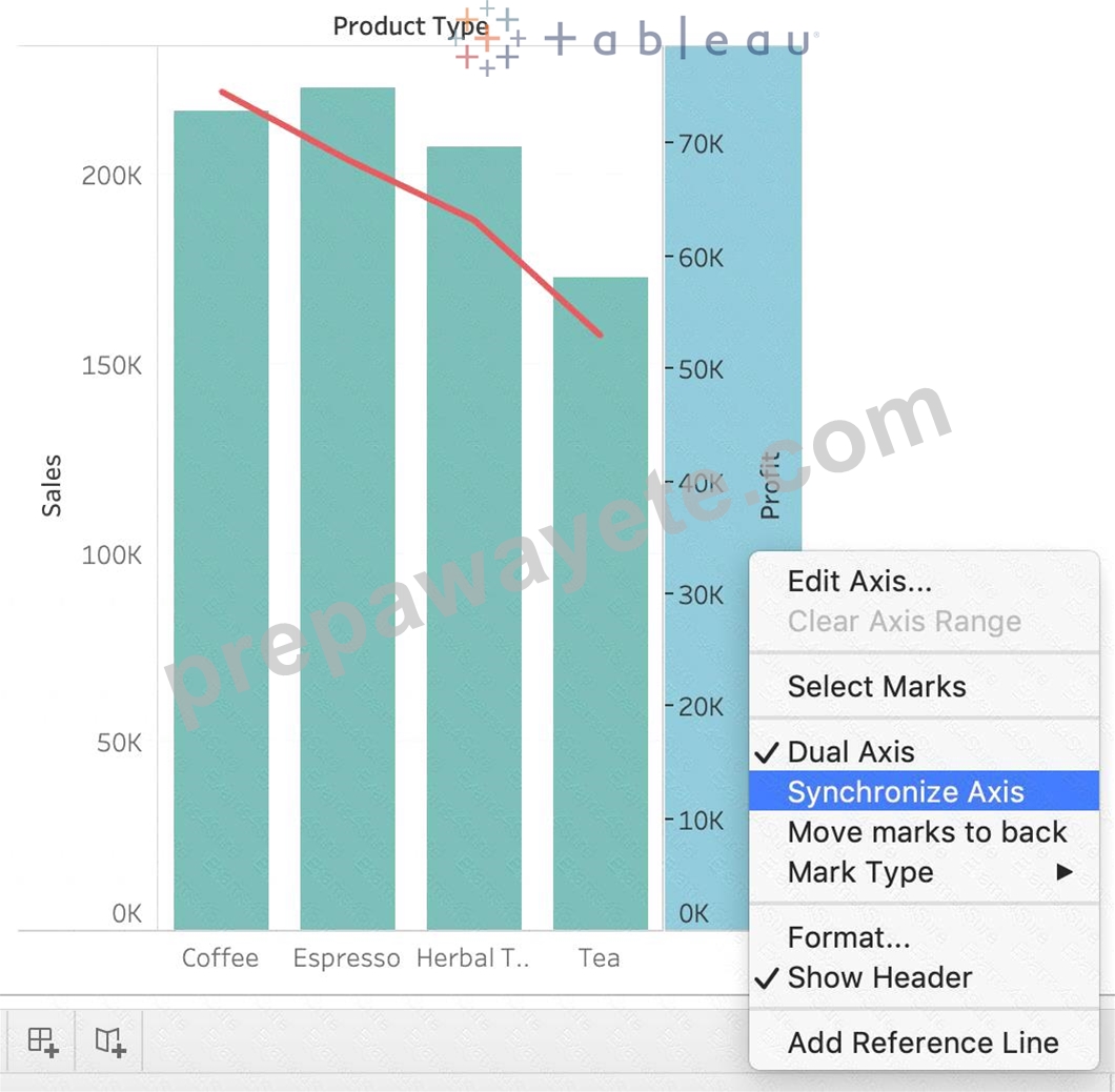
5) Finally, we synchronise the axis as follows: Right click on the axis, and choose 'Synchronise axis'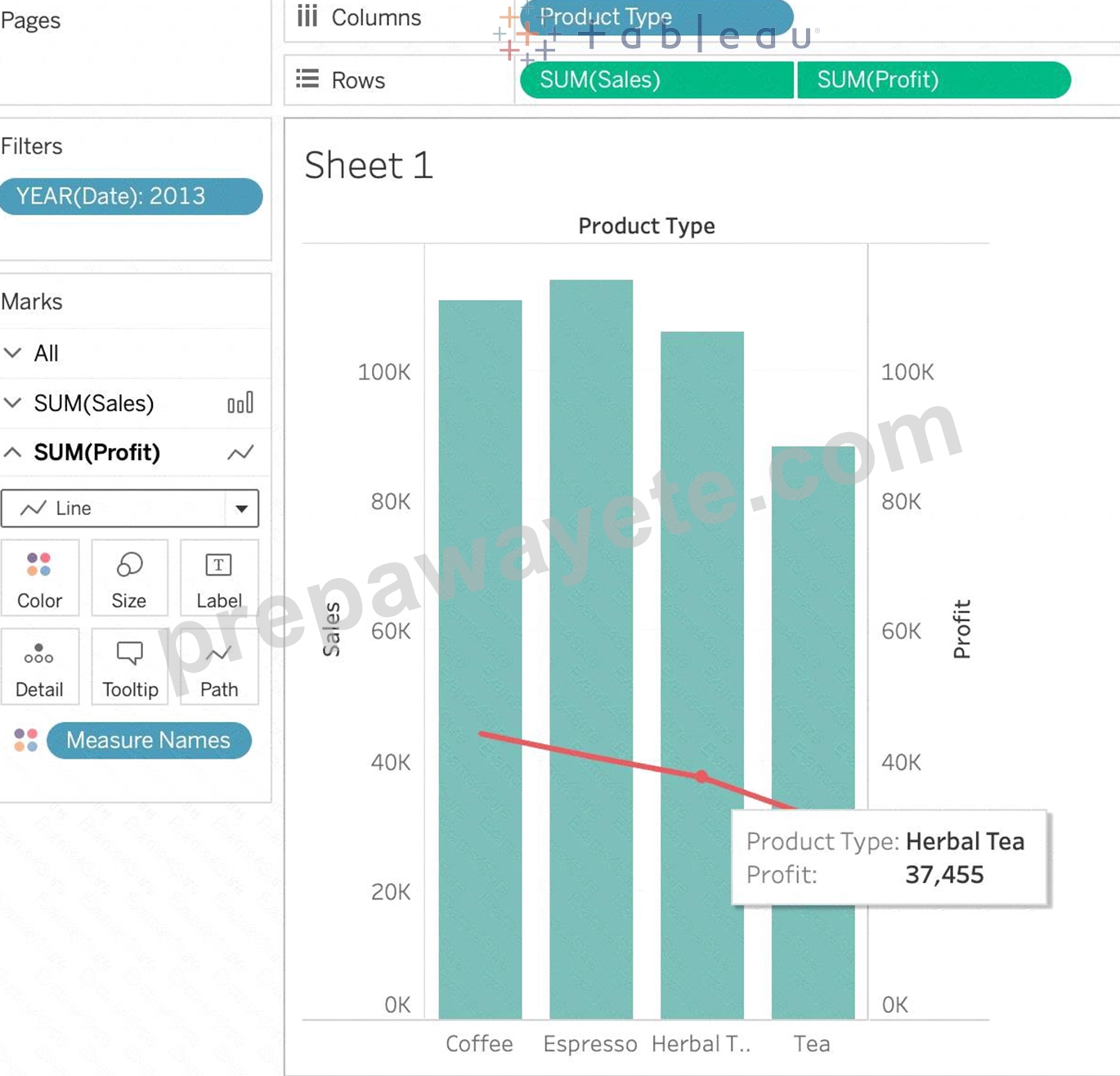
And, our final view and answer is:
NEW QUESTION # 37
You can _______________ your data to combine two or more tables by appending values (rows) from one table to another
- A. blend
- B. join
- C. union
- D. concatenate
Answer: C
Explanation:
Explanation
You can union your data to combine two or more tables by appending values (rows) from one table to another.
To union your data in Tableau data source, the tables must come from the same connection.
For example, suppose you have the following customer purchase information stored in three tables, separated by month. The table names are "May2016," "June2016," and "July2016."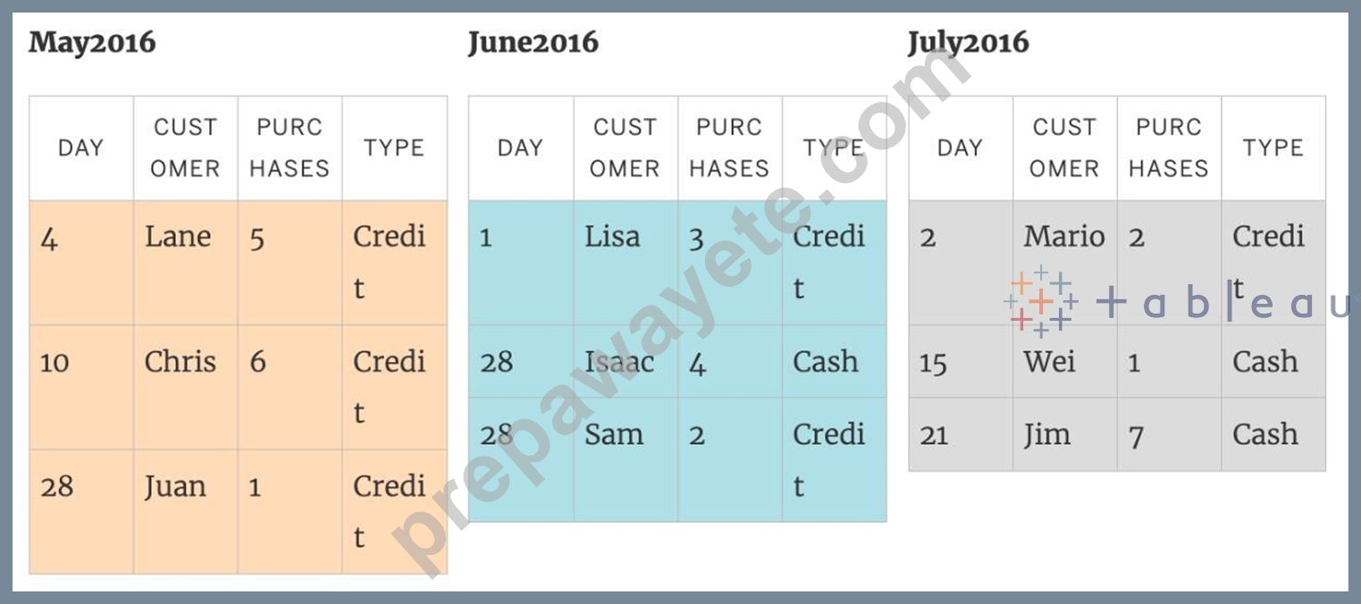
A union of these tables creates the following single table that contains all rows from all tables.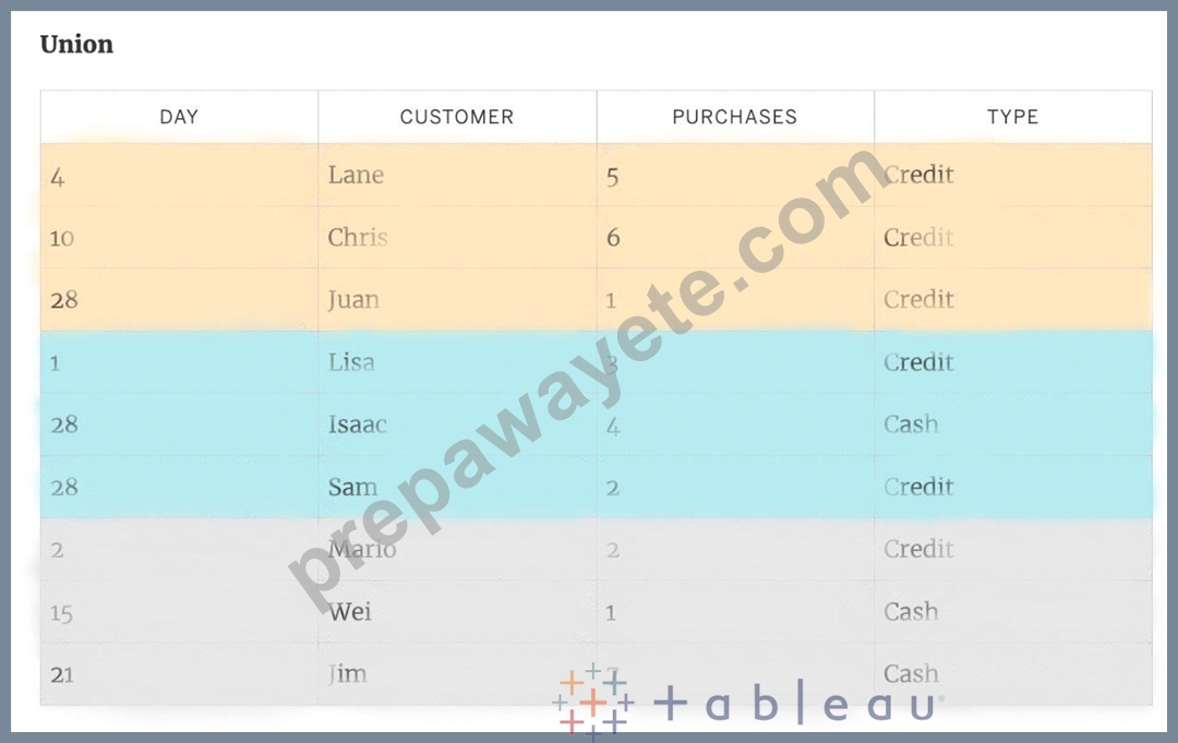
NEW QUESTION # 38
Suppose you have a bar chart. When we group by labels in a view, which of the following happens?
- A. The colours of the members selected are now the same, and different for the rest of the members.
- B. A new mark (bar) is created, which consolidates all members of the group.
- C. Nothing changes in the view, but a group is created in the Dimensions shelf.
- D. Trick question! It is not possible to group by labels.
Answer: B
Explanation:
Explanation
*Very important question*
If we select the labels in the view and then group, a new consolidated mark is created - in our case bar since we are talking about a bar chart in the question. See below: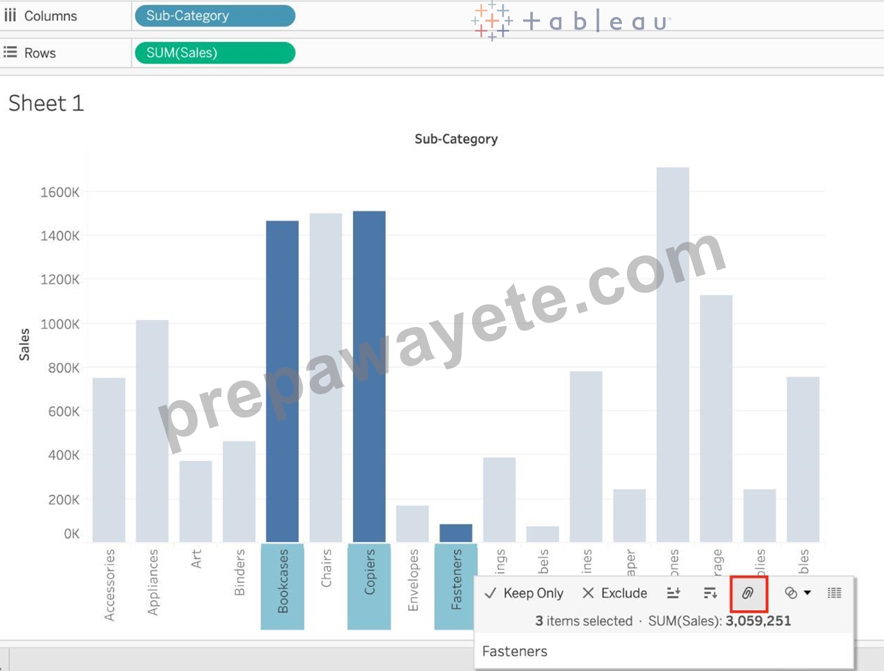
Then on grouping, a new bar is created, and the colour of all bars remain the same.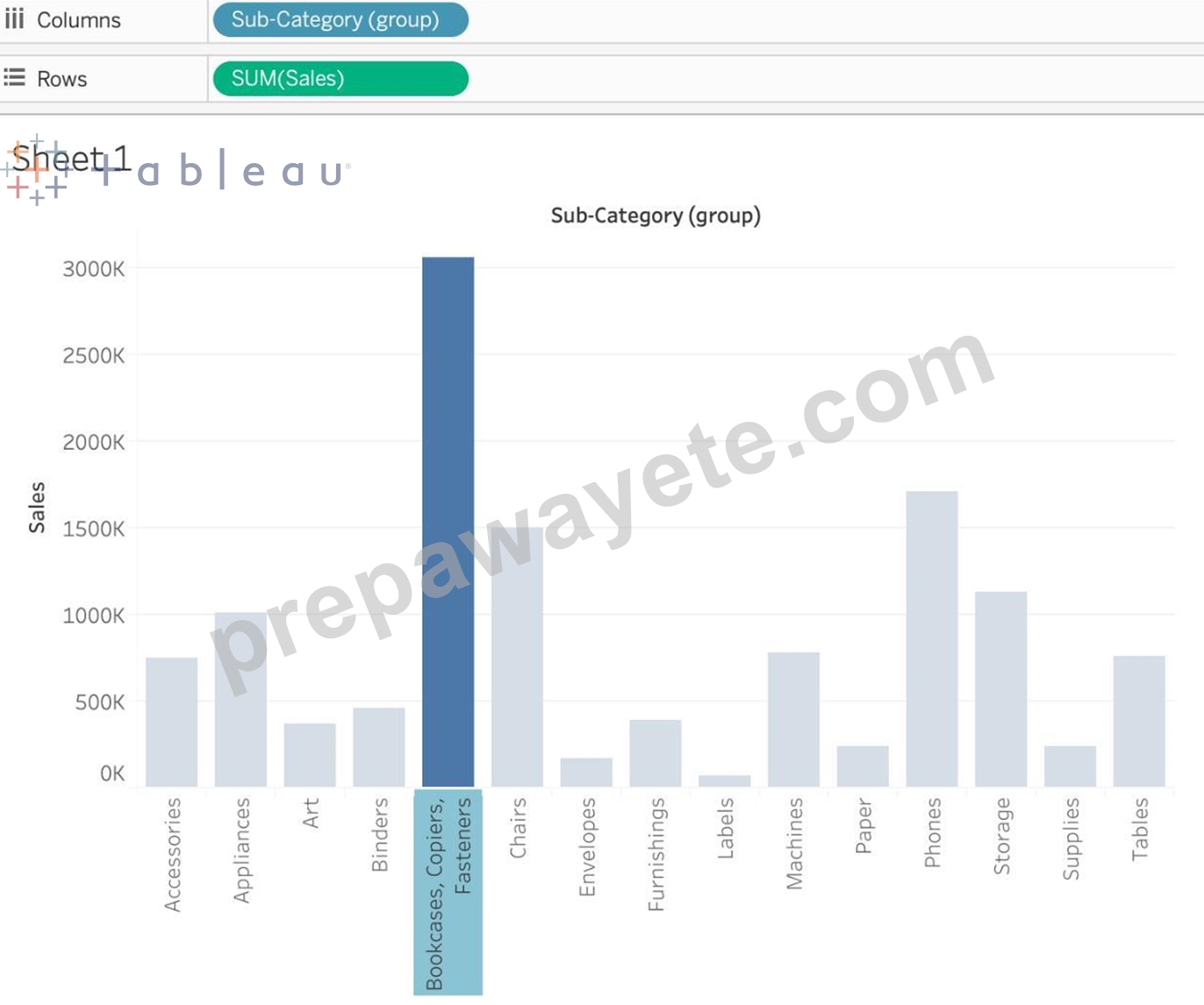
Had we grouped by choosing the marks instead of the labels, the following would be the result: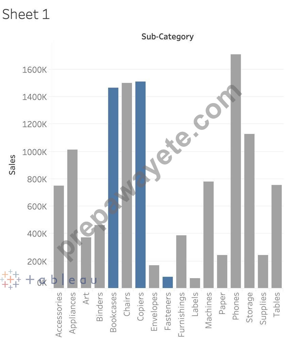
NEW QUESTION # 39
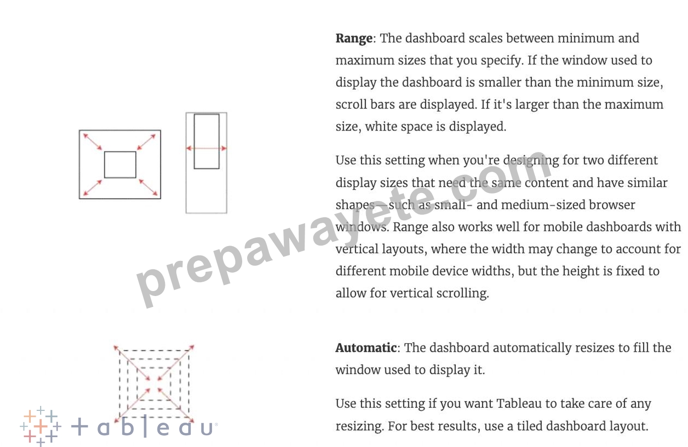
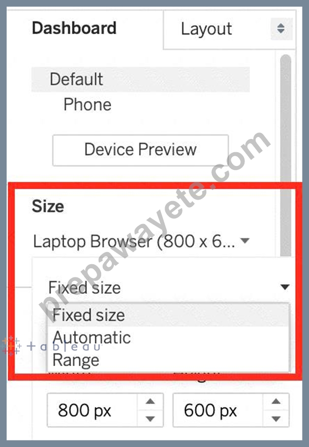
Which of the following are valid Dashboard size options?
- A. Fixed Size
- B. Range
- C. Scaled
- D. Automatic
Answer: A,B,D
Explanation:
Scaled is NOT a valid size options when creating Dashboards in Tableau!
After you create a dashboard, you might need to resize and reorganize it to work better for your users.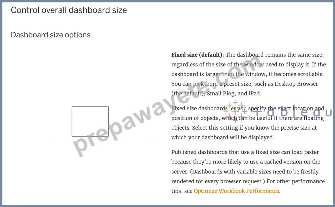
NEW QUESTION # 40
......
Get Ready to Pass the Desktop-Specialist exam Right Now Using Our Tableau Desktop Specialist Exam Package: https://www.prepawayete.com/Tableau/Desktop-Specialist-practice-exam-dumps.html
Enhance Your Career With Available Preparation Guide for Desktop-Specialist Exam: https://drive.google.com/open?id=1rN2Q43z5D0Wg_SJpl5AF1LcZ_gX9Ym4V